Maybank
A clearer path from product discovery on the website to continuing an application in M2U.
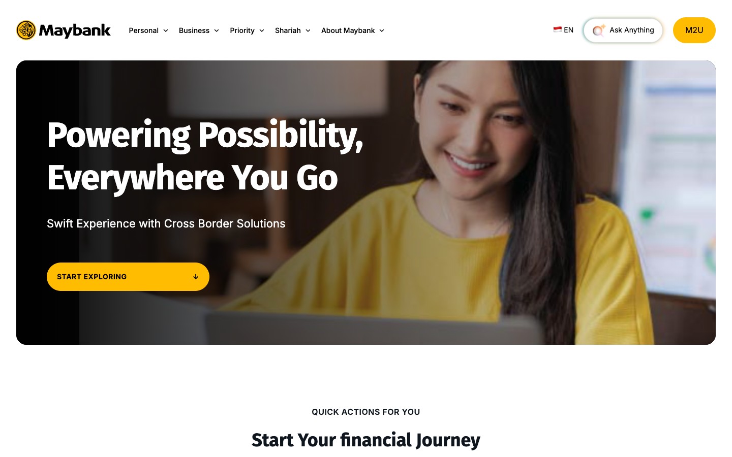
- Role
- Product Designer
- Team
- Lead Product Designer and Product Manager
- Scope
- Website assessment, information architecture, product discovery and application
- Outcome
- A design vision for how customers discover banking products, begin an application on the website and continue in M2U
The challenge
Maybank Indonesia wanted a website that made its banking offer easier to discover and understand. The design challenge extended beyond refreshing the interface: customers needed a clear route from an initial financial goal to a relevant product, then into an application that continued in M2U.
As Product Designer, I worked with a Lead Product Designer and Product Manager on the website assessment, information architecture and experience direction. I connected those decisions across the journey so discovery, product content and the next channel could work as one experience.
What made it hard
- The offering was difficult to see. Product routes were split across M2U, a conversational interface and a hamburger menu. Visitors had to explore several layers before understanding their options.
- A recommendation did not guarantee a useful next step. In the assessed chat flow, a non-customer could reach a generic announcement instead of relevant product details. Banking categories also did not always match the need someone arrived with.
- The journey crossed channels. Discovering a product on the website and completing identity verification in M2U required a clear explanation of what could happen now and what would happen next.
What I did
I assessed the sitemap, information architecture and key journeys, then defined a shared framework with distinct page responsibilities: the homepage orients, categories narrow the options, and product pages help customers decide. Visible product groups and goal-led quick actions offer useful starting points before someone knows a product name.
I used Nadia’s illustrative journey to connect the decisions. She arrives through Hajj savings, explores MyArafah, considers other Syariah accounts, searches by a different need and returns to begin registration. The story tests whether each route carries her interest forward.
Search lets visitors describe a need in everyday language, with relevant products and a path back to earlier interests. Clearer benefits, scannable principles and ordered instructions support the decision once they reach a product.
For registration, the website begins with focused contact and credential steps. Confirmation explicitly names the remaining work in M2U: log in, verify identity and activate the account. The handoff becomes part of the application journey.
What changed
The work established a connected design vision for product discovery and application: clearer information architecture, visible navigation, search by intent and a website-to-M2U continuation. A shared page framework supports distinct banking identities while keeping the experience familiar.
The outcome was a direction the team could assess across the whole customer journey, with the reasoning visible alongside the interface. It brings the strategic assessment and interaction design together; no post-launch performance results are claimed.